
 It’s all about Contrast !!
Contrast in Colour, Contrast in Pattern, Contrast in Scale and Contrast in texture
Let’s look at Colour
I’m a big fan of calm quilts.
What do I mean by this?
Colour palettes with colours that lie next to each other on the colour wheel.
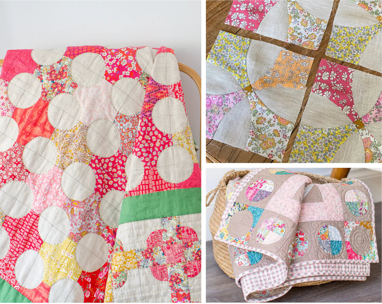
Take a look at my Beaumont Square Quilt below - it’s a mix of red, orange, pink and a few pops of yellow. They all lie next to each other on the colour wheel. And while the quilt would have been gorgeous and mellow with this colour palette, I thought it needed a pop of something else to make it interesting.
Enter the brilliant green linen.
Why green?
Take a look at the Liberty colour wheel above, green sits opposite the red and invariably colours that sit opposite each other on the colour wheel are a great way to add an harminous pop of colour to an existing palette.
And when I say pop, I also mean a ‘wow’ to your colour palette.
It doesn’t have to be a lot of this contrasting colour, the green linen and small green stripe is enough to add some interest to your quilt without overpowering it.

So, moving on to pattern
I’m also a big fan of having a variety of pattern in a quilt. I think it makes a quilt come alive.
While I love Liberties, which are usually pattern dense - it’s great to combine them with the odd spot, check or stripe and most importantly Linen. The contrast in pattern gives your eye somewhere to rest so that you can appreciate the Liberty heroes.
My Flowering Snowball Quilt is a perfect example of this. Liberties shine in contrast to low volume graphic prints or alternatively to the Natural Linen. Without this contrast, the secondary pattern would be lost.

Contrast in Scale
This is harder for me to achieve in my quilts as I generally like to sew smaller pieces and any larger scale fabrics are generally lost given the size of the pieces I use.
So,
I look to varying the scale in terms of the components that make up the quilt.
Note, this excludes One Block Repeat quilts that have a charm of their own with their repeating pattern but is more relevant in my Medallion quilts.
Take a look at the Saving Liberty Quilt - a striking centre compass at the centrepiece, then surrounded by smaller quarter circle blocks.
Variance in scale - in not only block size but the size of the pieces within the blocks and also the type of blocks.
If I had surrounded the centre compass with larger star blocks for example, the ‘wow’ of the centre compass would have been lost or diminished competing with similar blocks around it.

And texture
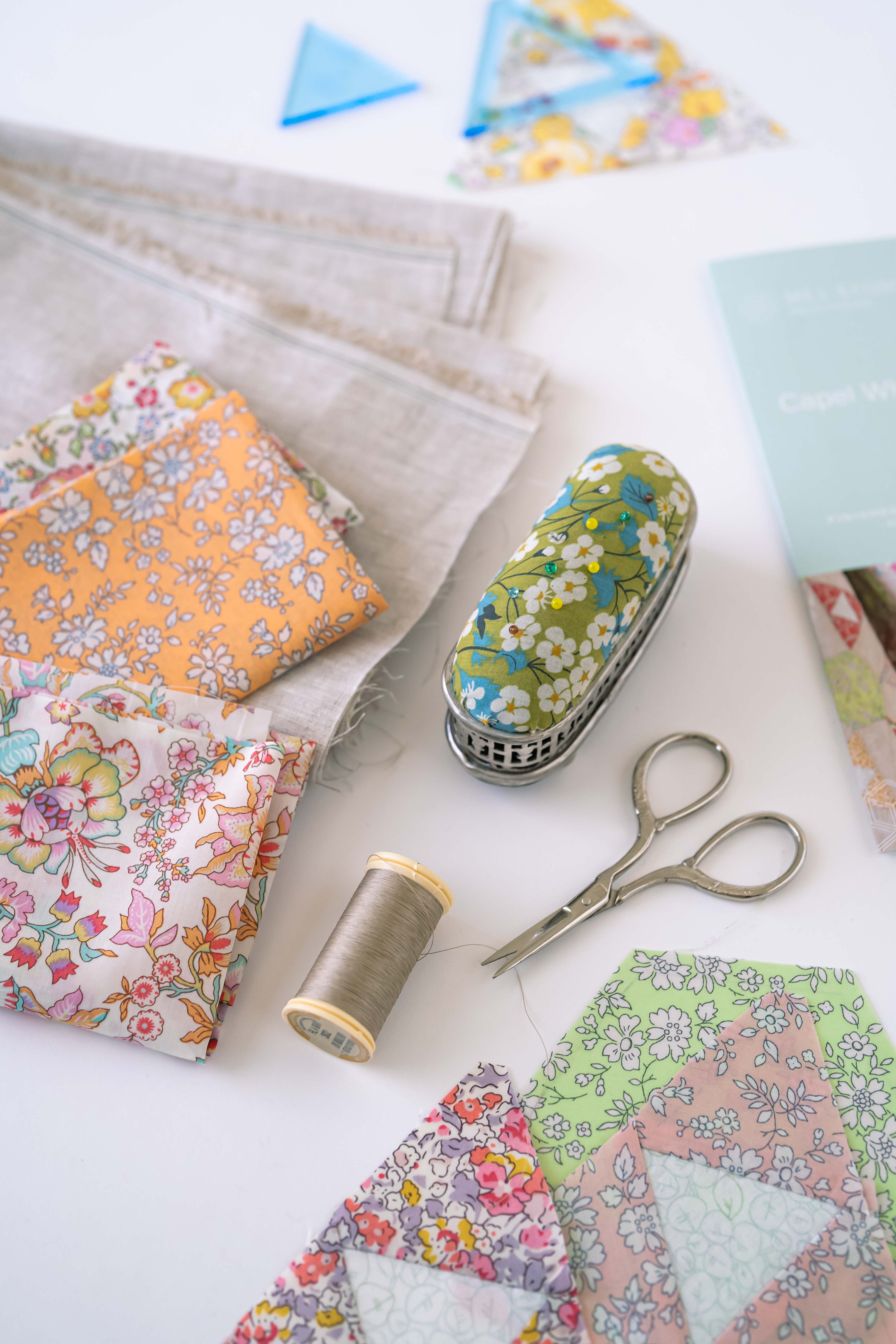
Contrast in texture for me is really important. It’s a tactile thing. And while this is easy achieved with your quilting, another way is by combining Linen and Liberty Tana Lawn.
The fine weave of the lawn next to the more dominant weave of linen is the bomb as far as I’m concerned.
Add to that some hand quilting with 12wt thread - so that your quilting becomes a feature rather than just utilitarian and your contrast journey is complete.

Do you have the Wow?
You might be looking at your current project and assessing this right now. Looking at colour, pattern, scale and texture.
Just remember that it doesn’t have to be a radical change to give your quilt it’s wow.
You might just need a small pop of a contrasting colour - take a look at the other side of the colour wheel.
Maybe add a stripe somewhere - even if you’ve finished your quilt top, a striped binding is a great way to add some wow.
Look at how you could rearrange your blocks. Maybe add in a narrow border of Linen or even a Liberty Capel - the ultimate neutral, to give your blocks the chance to breathe.
And texture - your quilting will help you here. And even if you are getting someone to longarm your quilt - how about adding a linen backing?
Don’t be afraid to change it up and have a bit of a play. Audition your changes - you might be surprised with what you come up with.
Colour, pattern, scale and texture -
they’re all available to you - to change, pivot what you are sewing or keep in mind when you start that next quilt.
Until next time, happy stitching
Mel


Leave a comment