

Choosing a Colour Palette is personal
There are no right or wrong ways of doing this, ultimately it comes down to choosing colours, patterns and textures that make you smile.
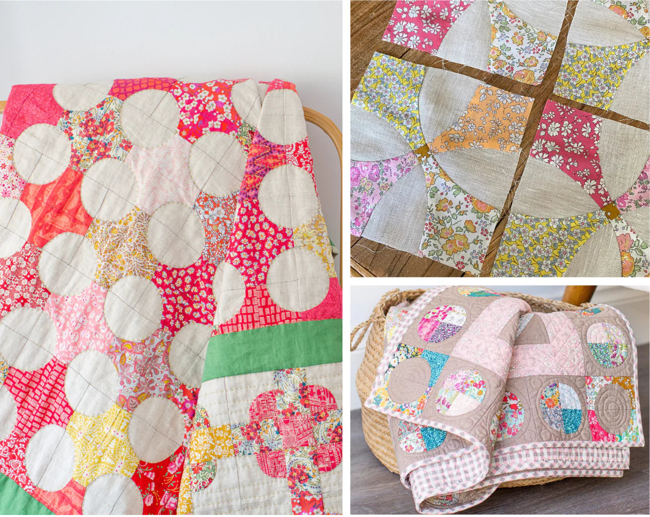
Often a quilt will start for me when I see a gorgeous fabric that I have to cut into. For Clifton Ties it was all about the linen. And although the colour and texture of it drew me in, it turned out to be a love hate relationship, with the weave being looser than I normal work with and being quite frankly not that much fun to sew with.
But I loved the way it looked - the colour sang to me.. the texture was divine and quite simply several blocks into it - I decided it was worth it.
Consequently, it only made it to lap size but that’s ok. Lap size quilts in my house are probably the most used quilts as they hang out on the end of the lounge waiting to pulled up and over people when the need arrives.
If you are new to quilting you might be thinking - what is lap size? Well it varies in probably every pattern you look at but for me it’s nose to toe and the width of the span of my arms - all important measurements to ensure full coverage when it’s cold - it’s a comfort thing.
 Liberty Tana Lawn Colour Wheel
So, back to colour and developing a colour palette.
Start at one point on the colour wheel and choose fabrics moving slowly around the wheel,
especially if you are new to quilting - this takes away some of the overwhelm of choosing.
Save my Liberty Colour Wheel photo to the notes in your phone and you will always have it for reference.
Now, let’s take a look at choosing fabrics for a new Clifton Ties Quilt. Choosing a delicious blue/grey linen, perhaps the lightweight Seaweed Linen or the Antique Wash Steel Grey Linen - the blue section of the colour wheel is the obvious starting off point. The bespoke Capel W is a beautiful hue and perfect to set the tone..
Then collect some other blues varying the pattern and intensity to keep things interesting.
Featuring:
Capel W, Danjo E, Theo F,
King of Hearts C, Endless Love C, Delft Lagoon A, Ophelia’s Silhouette C,
Fruit Punch B, Azores C, and Betsy Pastel.

Betsy Pastel is a great jumping off point as we move adjacent to the blue on the Colour wheel into the mauves. I’d also add some greys at this point. I’m not sure when greys became my go to neutrals but I love the calmness of them and they blend beautifully with the palette we are forming. It’s also a good time to add some prints with neutral backgrounds as we move into the pink section of the Colour Wheel with our next jumping off point BetsyPeach.
NB: In real life, Betsy Peach is a little more subtle in colouring.
Featuring:
Betsy Pastel, Shamrock Scene A, Capel K.
Survival B, Diamond Sky A, June’s Meadow F,
Ocean Treasure C, Theo E and Betsy Peach.

Betsy prints are so versatile for adding other colours to your fabric palette.
Add some more peachy/pink fabrics to the mix and Capel Cloud to calm things down.
It’s now time to stand back and have a look..It’s all looking beautifully mellow - which I love by the way. It all goes back to that calm that I like to have in my quilts which is easy to achieve if you pick fabrics that are adjacent to each other on the Colour Wheel.
But there is a fine line between being mellow and calm and being visually uninteresting.
Jump to the other side of the Colour Wheel and Add a Zing..
whether it’s subtle or hits you over the head - the choice is yours.
The zing in this case is yellow and leads me to my all time favourite - Capel Chartreuse. I don’t know what it is about this colour - but it makes my heart sing and has been sneaking it’s way into some new quilts that will be released this year.
Choosing some more yellow fabrics leads to Charmain B which blends beautifully and picks up the mauve we have already chosen.
Featuring:
Betsy Peach, Capel Light Peach, Mortimer C,
Capel Cloud, Pepper V, Little Ed D, Capel Chartreuse,
OperaHouse A, Charmain B, Betsy Pastel.
Note: The scan of Capel Chartreuse doesn’t show the true loveliness of it’s hue - take a look at the listing to get a better idea.
 So my palette has pulled together - this is my starting point. I do add and take away from it as I sew. After sewing some blocks I might find it needs a little bit more of something here and there. The important thing is that you have a basis that you can easily slot in other fabrics now that you know the direction you’re going in.

New Directions
are so easy to take - it’s very easy for me to get distracted when it comes to fabric and colour. When I released Clifton Ties, I also put together a Dusky Pink Quilt kit, seduced by the Dusky Pink Antique Wash linen that I had newly added to the store. A softer palette developed with a bit of overlap from the original blue palette. The peach tones needed to go and I threw in a few darker pinks to give some more contrast.

Recapping my tips on developing a colour palette.
Building a palette - is personal. I’m a strong believer in it’s also all about how you’re feeling at the time. Different days can take you off in different directions colourwise but if you have brought together a base palette or fabric pull you’ve got the tough decisions made.
Start at one point on the colour wheel and choose fabrics moving slowly around the wheel,remember to vary the pattern and scale to make things interesting.
Jump to the other side of the Colour Wheel and Add a Zing..whether it’s subtle or not - the choice is yours.

Making Clifton Ties, I did end up with some blocks that I didn’t like - they just didn’t gel with the rest. But I find that it does happen sometime. Don’t be afraid to restrict your palette a little - you’ll find you have a mix that you love.
Take some time and stand back and have a look. If something is not working and you can’t work out what it is - it may be a certain fabric that polarises or the pattern of a fabric that jars with the rest.
All up, don’t get too stressed - if you’re not sure - leave it all out and go back to it the next day - you’ll look at it differently I’m sure. And just go with your gut - after all it’s your quilt and you’re the one who needs to like it.
Happy Stitching
Mel


Leave a comment