
Let me help you !!
When you venture out of just using one fabric range for a quilt, the idea of picking fabrics can be daunting. How do you get the right balance of colour and pattern? This is what I am hearing from you and I’d like to help you be confident in choosing fabrics and achieve a visually appealing fabric palette that you are happy with.

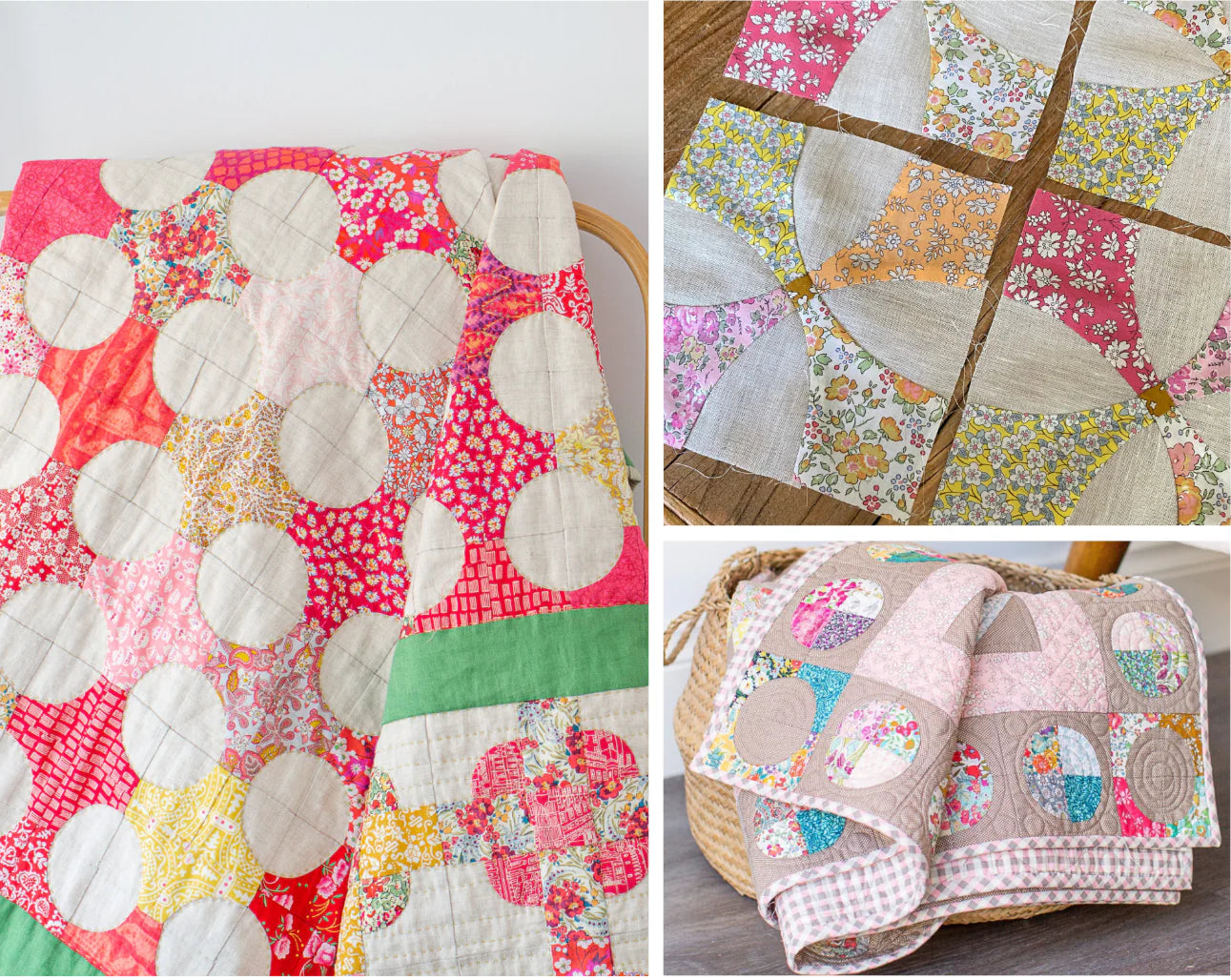
Take a look at my Flowering Snowball Quilt..
It’s predominantly Liberty Tana lawn set in low volume cotton fabrics.
At first glance it’s a Scrappy Quilt with a whole lot of different fabrics and colours thrown at it.
Look at it a bit longer and you will see the colours that pop. I like to think of this as a restricted scrappy palette. I think it’s the secret to not having your colour palette look like a train wreck.
Breaking it down a bit further..
I chose shades of aqua, pink, orange and lime green.
So, lets start..
Choose some shades of Aqua and vary the prints.
Varying the scale of print is so important. If for example, I chose a selection of similar coloured aqua prints all with the same scale motifs regardless of what they were, they would just blur together and from a distance they would all just read as the same fabric and be visually uninteresting.
The Queue for the Zoo print (top left) is also great to bring in the lime green and a soft pink.

Choose some more fabrics that coordinate and include the green - the yellow Betsy (bottom right) is the perfect launching point to start choosing varying shades of pinks.
Again, vary the scale and intensity when choosing these.

You might have already noticed..
We have ended up with two palettes.
The cool palette of Aquas and a warm palette of Pinks.
Intentional or not they would sit great by themselves as a colour palette for two individual quilts. But together they combine harmoniously, with the yellow and sorbet green linking the two.
Now we have a core palette for the Snowball Quilt
As with most instructions for my quilts I suggest taking a photo and add it to your favourites.
What’s next..
There are 168 Flowering Snowball Blocks in my quilt - so you’re going to need some more fabric. You can easily repeat your chosen fabrics but keep in mind, variety is key to getting that scrappy look.

Using this core colour palette that you have built, start adding to it, either randomly or go through the process again with your stash or keep it in mind when choosing new fabrics.
Remember to vary the scale of prints to keep it interesting.
I’m a big fan of the Liberty Capel print that comes in so many amazing colours. It’s great for it’s colour value but the calmness of the print allows your eye a chance to rest in amongst the busier Liberty prints, giving them a chance to shine.
What about the low value background fabrics..
I used a variety of grey/white graphic fabrics in my quilt which are fairly easy to source.
If you want to calm down the effect of these, you could use the same background fabric for the entire quilt. My beautiful Natural Linen would look amazing too. The choice is yours.

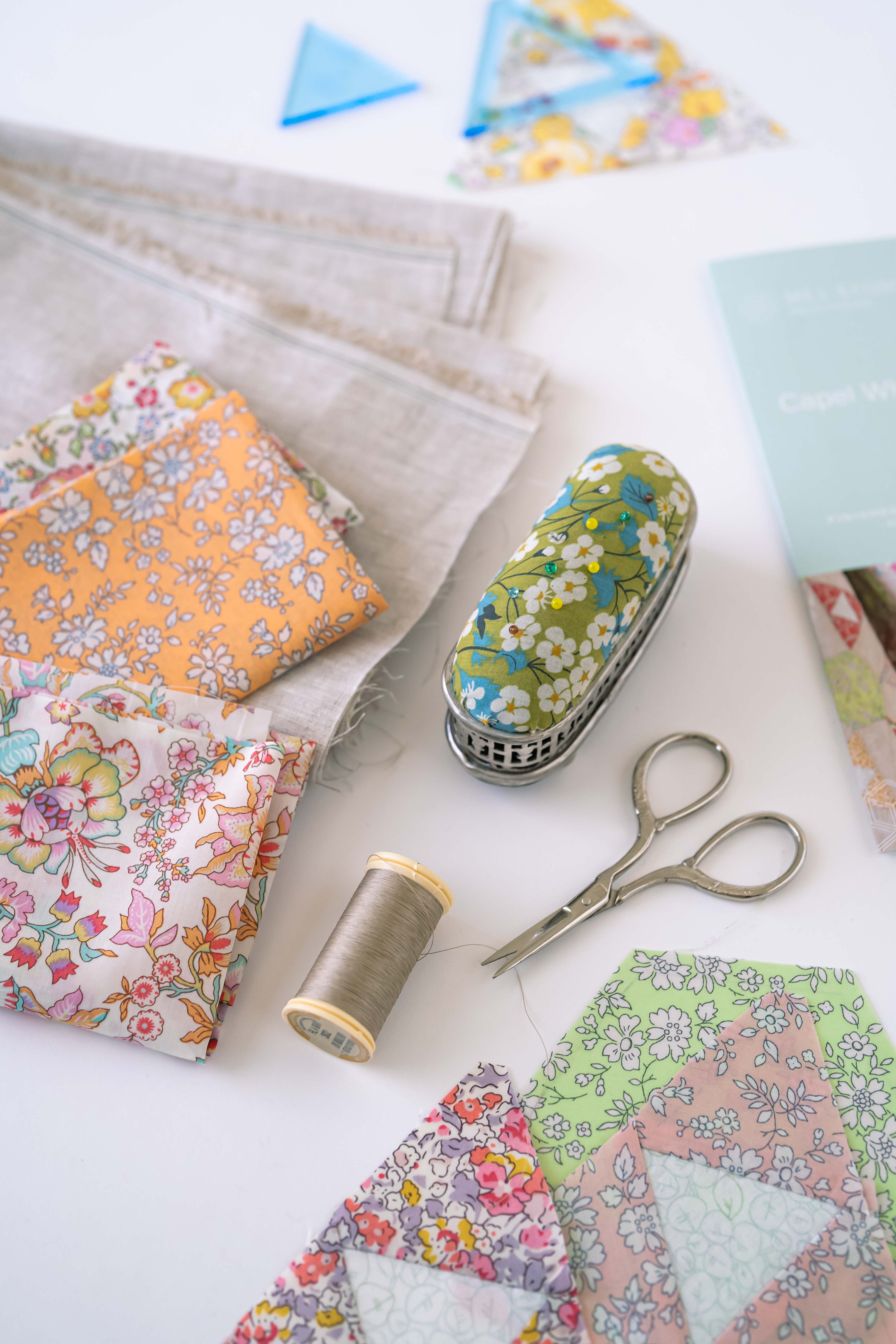
Jumpstart your Liberty Collection..
If you are new to Liberty fabrics or would like to get a jumpstart on your Flowering Snowball quilt - the fabrics in this blog post are available as a Starter Kit in either Fat Quarter, Fat Eighths or Fat Sixteenths Bundles.
I love seeing what you create with my patterns and would love to see your take on the Flowering Snowball Quilt Colour palette. Comment below or tag me on Instagram using the hashtag #melstoreypatchwork
Until next time, happy stitching
Mel


Leave a comment